Introduction
In this post we are going to go over what it takes to create a control, and more specifically a Vista Search Box like control.
Definition of Current Search Box
The first thing to do when creating a new control for Windows Forms is determine all the states of the control. In our case the control states are rather simple:
Inactive:

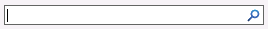
Active:

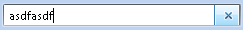
Text Entered:

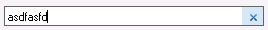
Button Active:
Creating the Search Box
The next objective is to determine the inputs, outputs, and events for the control.
Inputs:
- Text
- Button Click
Outputs:
- Text
Events:
- Text Changed
So now that we have all the inputs, outputs, and events determined, we can start creating the control. The first thing to determine is if we already have a good starting point control that does mostly everything we need. You may be thinking that TextBox Control is a perfect starting point. Normally I would agree with you, but there are certain properties of the TextBox Control that provides states to our search box that shouldn't be available, such as Multi-Line TextBox, and Password TextBox, both of these examples fall outside of the scope of what our TextBox is suppose to accomplish.
So that leaves us with Control, which is the basis, for all Graphical Objects in the Windows Form library. The pros of using Control over an already established object is that you get to define the exact inputs, outputs, and events that you need. We now need to define all the appearance related properties for our SearchTextBox.
- HoverButtonColor
- ActiveBackColor
- ActiveForeColor
- InactiveBackColor
- InactiveForeColor
- InactiveFont
- InactiveText
[Category("Appearance")]
[DefaultValue(typeof(Color), "GradientInactiveCaption")]
public Color HoverButtonColor
{
    get { return _hoverButtonColor; }
    set { _hoverButtonColor = value; }
}

[Category("Appearance")]
[DefaultValue(typeof(Color), "WindowText")]
public Color ActiveForeColor
{
    get { return _activeForeColor; }
    set { _activeForeColor = value; }
}

[Category("Appearance")]
[DefaultValue(typeof(Color), "Window")]
public Color ActiveBackColor
{
    get { return _activeBackColor; }
    set { _activeBackColor = value; }
}

[Category("Appearance")]
[DefaultValue(typeof(Color), "GrayText")]
public Color InactiveForeColor
{
    get { return _inactiveForeColor; }
    set { _inactiveForeColor = value; }
}

[Category("Appearance")]
[DefaultValue(typeof(Color), "InactiveBorder")]
public Color InactiveBackColor
{
    get { return _inactiveBackColor; }
    set { _inactiveBackColor = value; }
}

[Category("Appearance")]
[DefaultValue(typeof(Cursor), "IBeam")]
public override Cursor Cursor
{
    get { return base.Cursor; }
    set { base.Cursor = value; }
}

[Browsable(false)]
public override Color ForeColor
{
    get { return base.ForeColor; }
    set { base.ForeColor = value; }
}

[Browsable(false)]
public override Color BackColor
{
    get { return base.BackColor; }
    set { base.BackColor = value; }
}

[Category("Appearance")]
[DefaultValue(DefaultInactiveText)]
public string InactiveText
{
    get { return _inactiveText; }
    set { _inactiveText = value; }
}

[Category("Appearance")]
[DefaultValue(typeof(Font), "Microsoft Sans Serif, 8.25pt")]
public Font ActiveFont
{
    get { return base.Font; }
    set { base.Font = value; }
}

[Category("Appearance")]
[DefaultValue(typeof(Font), "Microsoft Sans Serif, 8.25pt, style=Bold, Italic")]
public Font InactiveFont
{
    get { return _inactiveFont; }
    set { _inactiveFont = value; }
}

[Browsable(false)]
public override Font Font
{
    get { return base.Font; }
    set { base.Font = value; }
}

[Category("Appearance")]
public override string Text
{
    get { return searchText.Text; }
    set { searchText.Text = value; }
}
note: You will notice three different attributes on most of the class properties. They are Category, DefaultValue, Browsable, these are outside of the scope of this article, but I will tell you they effect how the Visual Studio IDE interacts with the SearchTextBox and its available properties at design time.
Next thing we need to do is hook up all the controls events to our specified properties so it acts as we expect it to as defined in our states above. The Control Events we are going to use in order to accomplish the for states that were listed above are: GotFocus, LostFocus, ForeColorChanged, BackColorChanged, Click, and TextChanged.
- GotFocus Occurs when the control receives focus.
- LostFocus Occurs when the control loses focus.
- ForeColorChanged Occurs when the ForeColor property value changes.
- BackColorChanged Occurs when the value of the BackColor property changes.
- Click Occurs when the control is clicked.
- TextChanged Occurs when the Text property value changes.
note: Please see the code listed below for how these events were implemented for our SearchTextBox.
Look & Feel
Well the Control Object isn't quite as full featured as some of the other controls in the library. So in order to give our SearchTextBox a border to make it look more like a text box we need to tell Windows to draw it with some Native Constants that Windows uses. I am not going to go much in to what all this means, but I will tell you that it draws a thin border around the control.
protected override CreateParams CreateParams
{
    [SecurityPermission(SecurityAction.LinkDemand, Flags = SecurityPermissionFlag.UnmanagedCode)]
    get
    {
        CreateParams createParams = base.CreateParams;
        createParams.ExStyle |= NativeConstants.WS_EX_CONTROLPARENT;
        createParams.ExStyle &= ~NativeConstants.WS_EX_CLIENTEDGE;

        // make sure WS_BORDER is present in the style
        createParams.Style |= NativeConstants.WS_BORDER;

        return createParams;
    }
}
The next and last thing we need to do to complete our control is set some more attributes that tells the Visual Studio IDE how to interact with our control.
    [Designer(typeof(CoderJournal.Controls.Design.SearchTextBoxDesigner))]
    [DefaultEvent("TextChanged")]
    [DefaultProperty("Text")]
    public partial class SearchTextBox : Control
The Designer Attribute is important because it tells Visual Studio IDE how to render our control. The most important part of the designer class which is outlined in the source package is it's ability to control how our control is sized. Because when you have a normal TextBox Control you can only size it vertically if the multi-line property is not set. So in order to duplicate this behavior we need to create this designer class.
public override SelectionRules SelectionRules
{
    get
    {
        return base.SelectionRules & ~(SelectionRules.BottomSizeable | SelectionRules.TopSizeable);
    }
}
Example of Use
SearchTextBox searchText = new SearchTextBox();
searchText.TextChanged += delegate(object sender, EventArgs e) {
    outputLabel.Text += Environment.NewLine + searchText.Text;
}
Our Search Box
The following may note be the exact look and feel of Windows Vista, mostly for technical reasons, but there are also some legal ones too. However for the most part you should find the functionality the same.
Inactive:

Active:
Text Entered:
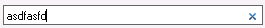
Button Active:
Application & Source
The following is a download of the application and the source of the code that we just went over. Please use the following source code in anyway that you see necessary, just please give my self, Nick Berardi, and this post reference when you use it in its current or modified form. This code comes with no warranty, and for legal reasons is not supported by me.
- Application Vista Search Box Application
- Source Vista Search Box Source
If you have any questions or comments about this article or the code please feel free to reply below.