One of the important things about web programming, especially when using AJAX, from a usability standpoint is to provide a responsive user interface to the audience. This level of responsiveness to the user’s actions can be achieved in many different ways; showing messages, changing colors, adding animation, changing contexts, basically anything that provides a natural transition from the action performed by the user to the reaction by the application to indicate that their action is actually causing something to happen.
One of the companies that has gone way beyond standard application responsiveness is a company called thirteen23. They put an amazing level of detail and thought in to every action that the user performs. A great example of their skilful approach to application development is a WPF Twitter client they call Blu. An example of the level of thought they provide is their reply feature they offer.
Not only are they solving a problem with this user interaction, but they are providing a feedback mechanism, with animation and context switching, to the user. If you haven’t already download the Blu client, you should definitely take a look at it, and notice all the subtle usability features that make it a really great tool.
A feeback mechanism we all can do
I don’t even think I could achieve what thirteen23 has achieved with Blu or even write up a good blog post about everything they have done right with this Twitter client. But one thing that I can do is show you how you can add an attractive loading panel to your website, with relatively no effort and that will provide ample feedback for your users during an AJAX request. For my example I am going to be using jQuery, but what I am showing you is easily ported to other JavaScript frameworks.
The example
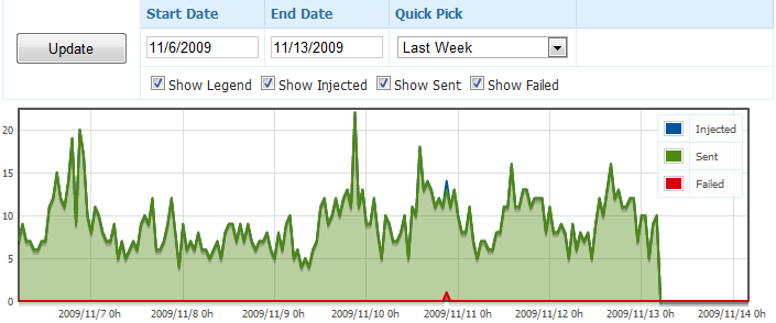
The first thing I have is this pretty graph with a couple of inputs and an Update button.
When I click the update button is does a standard jQuery.get(…) command against my web server to pull the new graph data. However depending on the date range, which dictates the number of plot points I need to pull for the graph, it can take anywhere from a half second to 5 seconds to pull all the data necessary to show the graph. A half second isn’t bad, because that is just about fast enough where they consider the new graph showing up a adequate response to their action of clicking the Update button. However 5 seconds is really pushing their patients. So in order to give the feeling of something is really happening because of their button click, we need to provide a feedback mechanism. The feedback mechanism I choose to implement was a standard loading window.
First things first
The first things we need to do is setup the necessary HTML elements and CSS styling. Before I went off and added in my HTML and CSS, I first needed to pick out a loading animated image that I liked and worked with the look and feel of the website. Lucky for me there is a great AJAX Loader generator at a site called http://www.ajaxload.info/.
After I found the image I was interested in using with my website, I then needed to add the HTML. The first thing I needed to do was create the desired content area, or update pane, that would be the focus area of the update. I did this by creating a wrapper around my graph, called report-pane, and then added an element called report-loading, which would be the loading window that would be styled by the CSS.
<div id="report-pane" style="position: relative;">
    <div id="report-loading" class="loading"><img src="/Content/images/ajax-loader.gif" width="32" height="32" /><br /><strong>Loading</strong></div>

    <!-- report here -->
</div>
The next thing I did was add in the CSS that would render my loading window in an appealing way that fit in to the design of the site.
/*  Loading
**********************************************************************/

.loading {
    position: absolute;
    display: none;
    border: 1px solid #5c9ccc;
    padding: 2px;
    background-color: #5c9ccc;
    color: #ffffff;
    opacity: 0.90;
    -webkit-border-radius: 5px;
    -moz-border-radius: 5px;
    width: 100px;
    height: 50px;
    text-align: center;
    z-index: 100000;
}
After I had the necessary markup and styles in place, the update-loading element I added to the HTML looked like this:
Now I can move on to creating the actual user interaction.
Enter jQuery
jQuery has a couple nice global events that trigger whenever an AJAX request being made. The two we are going to use today are called ajaxStart and ajaxStop. The method names are a pretty good indicator of their functionality, so I won’t bother going in to detail.
The actual jQuery JavaScript code for getting this to display is pretty trivial. Which speaks more to the power and flexibility of jQuery, more than anything else.
$("#report-pane").ajaxStart(function() {
    var width = $(this).width();
    var height = $(this).height();

    $("#report-loading").css({
        top: ((height / 2) - 25),
        left: ((width / 2) - 50)
    }).fadeIn(200);    // fast fade in of 200 mili-seconds
}).ajaxStop(function() {
    $("#report-loading", this).fadeOut(1000);    // slow fade out of 1 second
});
There are two things you should pay special attention to in the above code. The first is the fact that I want the loading screen to be positioned in the center of the graph so that, so that it is very apparent to the user what is being updated, and because their attention is already on the graph as the main focal point of their clicking of the Update button. I do this by taking half the width and height of the report-pane and subtracting the size of the report-loading box, this will give me the x and y coordinates at which to place the report-loading box inside the report-pane.
The second thing you should take note of is that I do a quick fade in of 200 mili-seconds, so that the loading box appears almost instantaneously after they have clicked the Update button. However on the face out, after the AJAX request has finished, I want them to really notice that the action has completed so I make the face-out 5 times longer than the fade in. This provides enough time for them to notice that the action has completed and that the plot points being shown in the graph have been updated.
Final Result
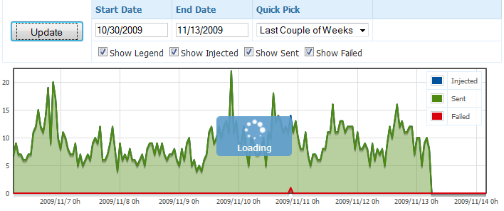
And here is what the final result looks like, after adding only a handful of code to my already existing application.
Not bad huh? And it didn’t even require any process change to my already working application. It was really that easy, so you really have no excuse for not adding a little flare and usability to your web application. Your users will thank you by lowering their anxiety level a little by not having to wonder if that button they just clicked actually did anything.


