So today it was brought to my attention that the design of my blog needed work. Since good design is a very subjective term, much like good programming:
your program (n): a maze of non-sequiturs littered with clever-clever tricks and irrelevant comments. Compare MY PROGRAM. my program (n): a gem of algorithmic precision, offering the most sublime balance between compact, efficient coding on the one hand, and fully commented legibility for posterity on the other. Compare YOUR PROGRAM.
Please tell me your impressions, of my blog, in the comments below. I would like to see constructive actionable comments, that I can work toward implementing, around the ease of reading, layout, and usability. That is what I am really interested in hearing about.
You can tell me what you think of the colors but honestly much like personal tastes in cars, food, and everything else, it is usually very superficial and relies on personal preferences more than industry recognized usability problems. My personal preferences, since it is my blog, is to use strong colors right next to each other to show strong lines, instead of gradients, because strong lines give the sense of strength and professionalism.
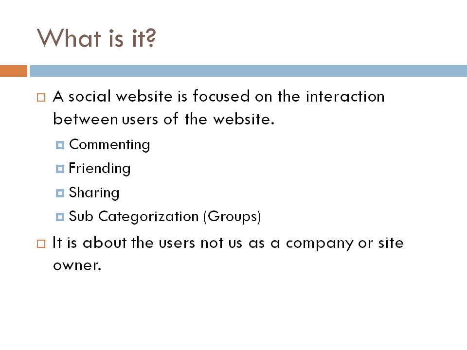
Honestly, if I was to break it down, I just like the look of a Orange, Blue, and Brown, I believe they provide nice contrast to each other and have an almost academic look. If I was to sum up my style I would say the Power Point Theme Median, as seen below, is the closest I have ever seen to My Personal Style Tastes.

So please let me here your comments, about my blog, on:
- Ease of Reading
- Layout
- Usability
I will take them all very seriously.