Last night as I was talking with Danny Diaz about the importants of good programming language documentation. It occurred to me that the level of effort a company puts into its documentation is a direct reflection on how it sees the developer in relation to its products. If there is a lot of thought, love, and detail put into the documentation the company most likely cares very much about the developers experience from cradle to grave. If the documentation is haphazardly put together and no common UIX efforts were made then the company most likely cares very little about new developers, and only begrudgingly puts documentation online for its seasoned developers because it is the industry norm and is expected of them.
As a test I decided to look at the documentation posted online for five of the most common languages found out there today, that are tied to a specific company.
- C# – Microsoft
- Java – Oracle
- Objective-C – Apple
- Ruby (Ruby On Rails) – 37signals (I know this is a framework, but this seems like the company with the most influence)
- PHP – The PHP Group
I needed to compare documentation on a somewhat equal footing, something that was going to be common across all the languages, so I settled on looking at the documentation for strings. As I was doing this I found some very interesting dichotomies between the layouts and presentation used by each of the companies, some just didn’t care, others cared a great deal. But the biggest factor was the usability of the documentation, some it looked like they simple wanted to present the information on the screen so they could say they have documentation, others cared very much about the UX, some look like they cared by like anything else a bad design seems to be weighing down their efforts.
Here are the five criteria I used to judge each set of documentations on a 0 to 5 scale.
- Quality of documentation
Does the documentation contain just the bare-essentials or does it contain helpful security, performance, and warning considerations that the developers should know about so they don’t run into too many gotcha’s too far down the line. - Ease of navigation
This is important because if you cannot navigate the documentation easily and drill into exactly what you need to look up, it severely hoppers you productivity as a developer. - Code use examples
Sometimes even if you have the API, the use of it isn’t exactly understood from the documentation alone, so examples of how the method should be used are always a welcomed addition for determining if you are on the right track or not. - Easy to read URL
Having an easy to read URL is important, because not only does it help with things like SEO, since Google is always the first place I go when searching for documentation, it also helps in quick navigation of the documentation if you know exactly the class you are looking for. - Ease of switching between documentation versions
Sometimes you queries in Google don’t exactly bring you to the right version of the documentation that you need, but if the site makes it easy to switch between versions then the right documentation is only a click away. Or on the other side of that coin, you cannot be using the latest and greatest in your job, but you still need to find relevant information to the version you are working with.
So lets get started.
PHP
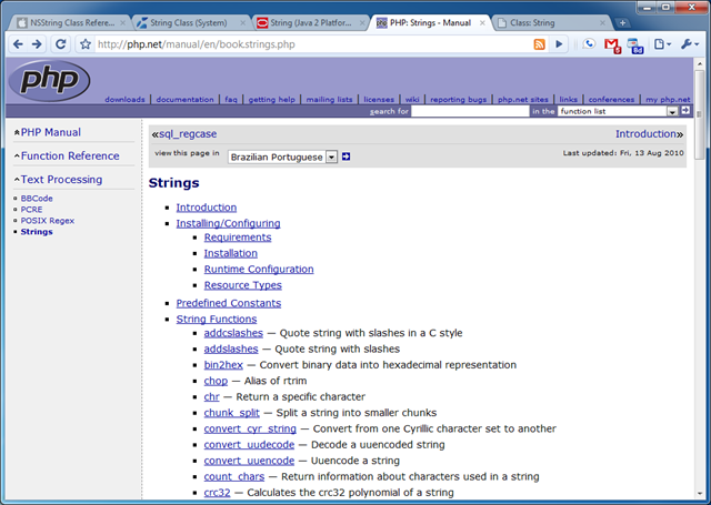
The PHP documentation for strings was very poor, but I think that is because strings are considered to be a primitive in the PHP world, so all they could do was document other methods that interact with strings. However, their over all documentation was poor and would have only received one out of five if it wasn’t for the excellent user contributed content and examples that each page has. I don’t know if the excellent user contributed content was born out of necessity of bad documentation, part of the culture, or a combination of both but it seems to get the job done for the most part. Besides the content the navigation was horrid, there is not an easy way besides search to find other relating documentation, besides drilling back up the navigation tree, and as far as I could see there wasn’t an easy way to switch to the different versions of PHP if you weren’t using the latest and greatest version. And they seem to maintain this mid-90’s book paging documentation practice that allows you to continue to the next section of the documentation as if it was divided in to chapters, which really only reinforces the point that they haven’t looked at their UX for probably at least 10 years. So that all contributed to the following scores:
- Documentation Quality (2/5)
- Navigation (1/5)
- Code Examples (3/5)
- Easy Url (4/5)
- Version Switching (0/5)
- Overall (2/5)
Ruby
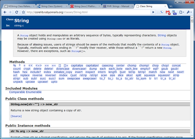
Note: The documentation provided on Ruby On Rails seems to be a direct copy from Ruby Doc.
The documentation quality was very good, but on the same token very minimal it only gave you very terse information about each method, but the saving grace was definitely the code examples as far as the actual documentation went. The navigation is very good for in-document jumping around, however it is very poor for browsing other classes in the Ruby language, on the other hand the URL’s seems to be cleanly represented and a power-user would be able to jump between documentation with easy by just using the URL. Version switching was non-existent. Which all resulted in the following scores.
Java
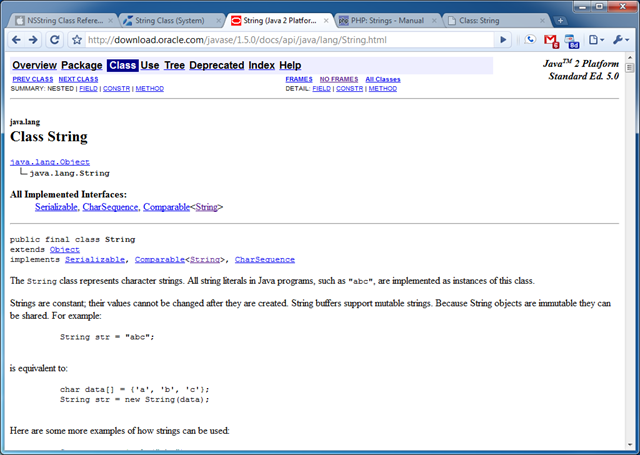
The documentation quality was very good, however after you get past the header of the document each method is only tersely documented and there were very few code examples or warning to base your decisions on. The UX as you might be able to tell hasn’t been updated probably since Java was released in 1995, their idea of navigation seems to be based on browser frames and one off targeted screens that just show a list of classes for instance in the namespace. On the other hand the layout was simple, and a power-user could easily jump around the documentation with a few targeted clicks to find out more about the properties vs methods vs constructor. The URL is very easy for a power-user to navigate through, because the classes and namespaces are right in the URL including the version, so it is everything you need to get right to the documentation you are looking for. You can easily navigate to other version of the documentation by just changing the version in the URL, which isn’t ideal, but it is better than no method at all. The only caveat is that the Java versioning isn’t consistent, but they seem to have redirects in place for common mistakes. This all resulted in the following scores for the documentation:
Objective-C
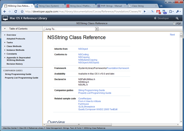
The documentation quality is very good, and if I had to guess Apple took the structure of the Java documentation and just added the typical Apple flare to it. Because most of the elements are laid out in the exact same order as the Java documentation right down to the navigation. But a plus for Apple is that they got rid of the 90ish navigation techniques and added something a little more modern, but still not that great. Instead of navigating the document by clicking links you select a drop down which will take you to the part of the documentation you are looking for. In addition to that they have a nice menu on the right hand side that lets you jump around the class, but nothing more, so you can’t use it to browse the entire library. One weird thing I encountered which I am still scratching my head at for the reasoning is the next button at the top of the page. It seems to take you just to the deprecated methods and then if you click it again takes you to the document update history, seems totally useless to me. In addition there was no way to switch between versions and the URL structure was the most horrid I have seen, so that all resulted in the following scores:
C#
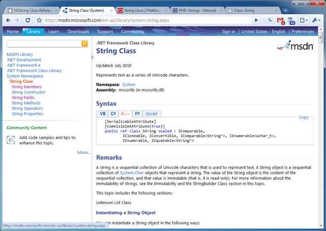
Lightweight
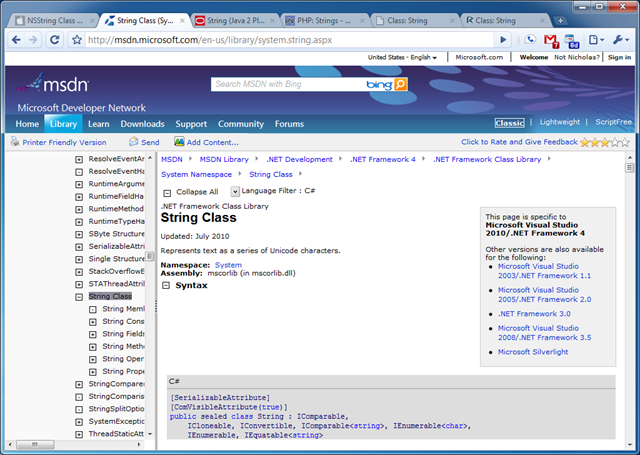
Classic
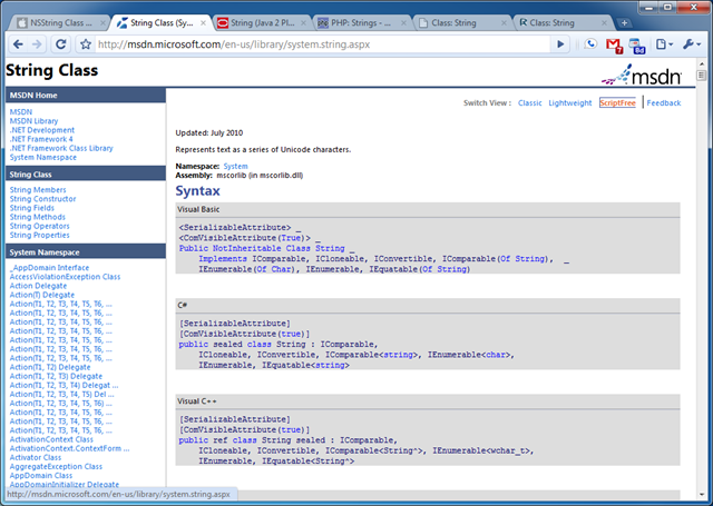
ScriptFree
I have to say that Microsoft is basically the cream of the crop as far as documentation goes. They have 3 different views of the documentation depending on your needs and habits for browsing. All 3 of the themes had a very clear UX that really shows that they care about how the developer perceives the documentation. Because of the three themes the navigation varied slightly between them but all of them were very consistent in layout and approach, which made transitioning easy. The URL is one of the easiest I have seen, because the structure is /{language}/library/{namespace}.aspx, which is very clear, easy to navigate, and short enough were you can easily tell where you are going before you click a link. The code examples were top notch and most methods and properties had full code examples that you could copy and past and run right in Visual Studio. In addition, they allowed community posting on the documentation like we found with PHP. And Microsoft was the only company that offered switching of versions right in the documentation, even though it was only the Classic theme it was a very nice addition. For the other themes you can switch versions with the URL. Other welcome additions was the namespace navigation in the Classic theme and ability to drill out of the namespaces with the other themes and see all the peer classes in each namespace. Overall I am very impressed by MSDN, which shows in the scores below:
Conclusion
As most of you know that have read my blog for any amount of time, I am a fan of C# as a programming language, and I always knew that MSDN had the best developer documentation. But it wasn’t until going through this exercise that I realized how far ahead Microsoft is in having one of the best developer experiences around.
I am interested in hearing what you like and hate about each of these documentation sites, and any others you think warrant a mention.