So today I was reading Jeff's Post on The Dramatic Password Reveal, and I had a flash back, to about a year or more ago, when I was working for a large bank based out of Pittsburgh who shale remain nameless. The flash back was to the usability nightmare that Lotus Notes and Lotus Sametime provided to anybody that had to do a simple task such as sending an e-mail (or Memo in Lotus Notes terminology). I think Jeff summed it up nicely and probably let Lotus Notes off a little easy by calling it a a massive train wreck.
Lotus Notes was so bad that I was actually considering quiting my job just to get away from the piece of software. Every time I had to look at the client interface I thought to myself where did I go wrong. This wasn't a bad job either, it paid very well, had good benefits, however the job wasn't really challenging. Combine that all on a 4 year old computer and a 15-inch CRT and you have my life at this job. So the lack of fulfillment and Lotus Notes drove me to look for another job after only a month and a half at the company.
I refer to Lotus Suite of Products as the AOL for the Corporate World for a couple of reasons. You have to think about AOL in terms of mid-to-late 90's mainframe terminal interface, not AOL's website in the new century. Unfortunately IBM hasn't brought Lotus Notes in to this century or even the late 90's. The following is my reasons for comparing AOL and Lotus Notes:
- Every link you get in your E-Mail (or Memo) needs to be opened with in the Lotus Notes client. Just like AOL required when clicking on a link in their Mail system.
- Every corporate form to collect information is done in a proprietary Lotus Notes data collector that tries to imitate Microsoft Access imitating a web form. Much like AOL did with all the forms available for their bazillion different pop ups.
- Lotus notes constantly crashed my computer. AOL did the same.
- Lotus notes had a built in proprietary IM client called Sametime. So did AOL. (See Lotus Sametime)
- If you think of everything you company has implimented, time tracking, specialized databases, calendars, task lists, corporate web, internet browsing, etc. You can bet Lotus notes has half assed that feature in to their product some how. Much like AOL did before they realized people hated that.
 The login screen. No real gripe with AOL about this, at least AOL didn't have hieroglyphics.
This dialog box contains several security "features":
- The hieroglyphics on the left of the dialog box are supposed to distract anyone who is peering over your shoulder trying to learn your password as you type.
- The number of characters you type is hidden; a random number of X's appear instead of one asterisk per character.
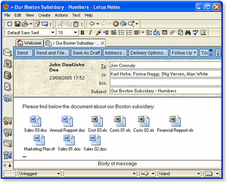
 The inefficient use of screen real estate. We all take writing an e-mail for granted with our nice large boxes for TO, CC, Subject, and Attachments. However in the Lotus Notes world your name and some numbers that only mean something to Lotus Notes takes up half of the real estate. I can only image this is in case you forget who you are.
Is it any wonder why it's often referred to as a train wreck of colossal proportions.
Apple fanboys are always talking about their wonderful interfaces that behave like a user is suppose to interact with a computer. As sort of a sick, but probably boring, reality show I have always wanted to sit them in front of Lotus Notes and tell them to have at it. Sort of a last man standing competition.
Also after a month on Lotus Notes, Microsoft Outlook and Exchange started to look like a gift from Heaven.
So that is my rant on Lotus Notes, it is now 12:30 AM, but I just had to get that all out. And that was just from seeing one picture on Jeff Atwood's website. Imagin having to work with the application every day.
Interviewing Tip: Always ask your future employer if they used Lotus Notes, if they say yes, politely end the interview and don't look back. Or just bolt from the room at full speed with out looking back. Either will allow you to achieve you goal of staying away from Lotus Notes.