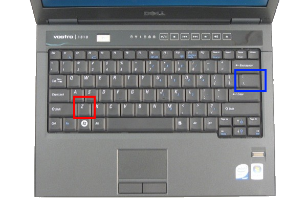
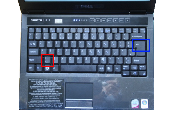
Today I was reading Engadget like I normally do in the morning to check out all the latest gadgets that they scour the internet for. And I happened across this new keyboard design that Dell is releasing with their Vostro models in the UK. I don't know about you, but I specifically stay clear of keyboards where the backspace key is crunched down to add the backslash key on the top row. (This is my personal preference, apparently I have to point this out to some of the commentors, because it is not clear by saying "I specifically") But I have never seen this keyboard layout before, where the backslash key is on the bottom left of the keyboard where the "Z" key is suppose to be. I think the usability engineer that designed this keyboard should be fired, that is assuming that Dell didn't randomly toss keys at the keyboard and let them stay where they fell.
This design has to be experienced because me describing it doesn't do it justice for how bad of a design it is.
US Version
UK Version
Somebody may want to mention this blunder on Dell Idea Storm.
Note (2008-10-14): The US keyboard layout is my personal preference because I like a spacious LEFT SHIFT key and I don't like my RETURN key so big. There are some people on the internet who think I am taking a shot at the UK by saying "I personally don't like their keyboard layout", this is not the case, and it really baffels me that I have to write this statement on my blog. So once and for all, this is my blog, my preferences, and anything above that I say about keyboard layout and design are my preferences.

